In issue # 006, Sept/Oct 2007, page 116, Ryan Bowman looks at the different presidential candidates' logos and analyzes them. Here is what he said about the three current contenders (I'm leaving out the others for now):
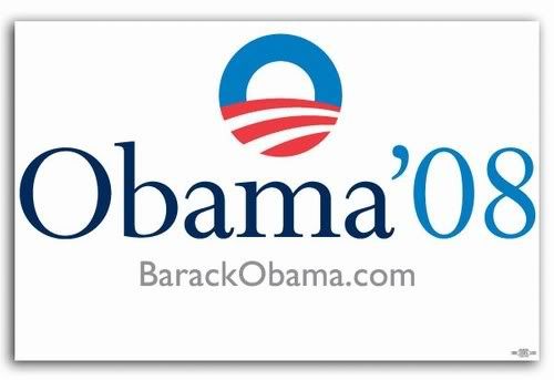
Barack Obama
Beautiful but empty. Tries hard to avoid the traditional vocabulary of political design btu ends up using the same familiar tropes - patriotic colors, red and white stripes, heavy handed Steinbeckian symbolism, and even a font named Perpetua.

Hillary Clinton
A ruthlessly efficient (and no doubt relentless focus-grouped) combination of the campaign logos of the past two presidents: The waving, stylized flag from that other Clinton and the one name simplicity from Bush, George W.

John McCain
So blatantly militaristic, the tagline might as well be "An Army of One."
I think it's really interesting how the logos describe the candidates, or at least the perception of the candidates. I really wonder sometimes how much people rely on visual cues like these in choosing not only who to vote for but what toothpaste to buy. I know that I prefer a specific acne medication because of its packaging - I am aware of the fact that before they changed the colors from dark blue and red and terribly chunky lettering to white with icy blue and light black lettering, I pretty much thought all of their products gave me acne. I, like many others (I assume), want to use medication for their pimples that comes out of a clean, crisp container, not brightly colored and obvious (um... like a pimple). At least I am aware of it, I guess.
No comments:
Post a Comment