Monday, March 31, 2008

I Made It! (List #6)

Phew, that was hard.  I had to backdate a couple of posts just because life got crazy, but this has been one insane month!  I am glad I was able to keep up with all the posting!

And now, for one last list:

Reasons why NaBloPoMo was really hard this month:

  1. I went to New York and Maryland and had limited access to the internet for a couple of days.
  2. Posting every day is hard to do!  I kept having writer's block and ended up having posts that were simply photos with little or no text.
  3. Interesting lists are hard to come up with.  I could list all kinds of things, like what are my next 10 songs on my playlist, or what shows I watch on Tuesdays.  But I wanted something to be interesting and related to the blog, which brings me to #4
  4. Not only is posting every day hard to do, but making a post related to art every day is hard to do.  It's good because it kept me thinking about arty things every day, not just on days when I went to class or to the studio.
OK So thus ends NaBloPoMo March: Lists.  Maybe I will do it again another month, but probably not April!

Saturday, March 29, 2008

Wedding Colors

(First of all, I did make a blog about the wedding: jewishgalwedding.blogspot.com, so this is an overlap in content but not a repeated post)

Since the wedding is going to be a year from today (March 29), it should be right in the height of cherry blossom season in DC, which is where we're hoping to have the wedding.  I think incorporating cherry blossom-related colors into the wedding would be a perfect homage to the season and local colors.  Plus, they are super, super pretty!


(I took this photo at the Cherry Blossom Festival in 2005)

So what I'm thinking right now, is yellow, green and chocolate brown with pink highlights (pink light the blossoms).  I'm also considering - in the back of my head - light blue, green and chocolate brown with pink highlights, because that is more in light with the colors of the cherry blossom festival, but I don't know how I feel about light blue at a spring wedding since it can be kind of a wintry color.  If the main colors were green and brown with light blue and pink I think it could be very springy.

Some people were very surprised at how excited I got about planning, but I think the reason is that I am seeing this as a great big art project that I get to live in!

Friday, March 28, 2008

Where to go?

So back when I was applying to schools I was hoping I would have this kind of decision to make but I didn't realize how difficult a decision it would be. I was hoping that I would get into two grad schools so I would have to decide, but I guess I assumed it would be pleasant to have a choice.

Now I have to decide: Chicago or New York.

I think we are leaning towards Chicago for a few reasons. First of all, the school is incredibly prestigious and I think I would get a lot from them that I may not be able to get from the school in New York. (On the other hand, I think the school in NYC has more opportunities for experience in the field built in, in Chicago you kind of have to make your own opportunities outside of the required internship if you want it) I kind of also feel like, if I go to the school in New York, I will always kind of wonder what it would have been like to go to the school in Chicago. I don't know that I would feel that way in the opposite situation. Also, JewishGuy feels like Chicago is a better city for us and our personalities, which may be true.

On the other hand, Chicago is EXTREMELY, extremely cold, and very far away from family. In New York, we'd be about a 4 hour drive from Boston and a 5 hour drive from DC (depending on how fast you drive). Chicago is significantly far away from all three of those cities (at least 12 hours drive). Also, we would be living in a teeny little closet of an apartment in New York for the same price as a moderately sized place in Chicago. And, living in Chicago there is a better chance of people actually visiting us - I think in the 6 years JewishGuy has been where we are now, his family has come down once, and he's had 3 friends visit. My family came down twice and I've had no friends visit. I can't really say I blame them... why would someone come to visit this city? So I guess even if we are in this disconnected city, people might come to visit, especially during the summer months for things like Lalapalooza.

On the third hand, as our friend pointed out, it's only two years. If we live there during my program and decide we don't really like it and want to move to New York or wherever after two years, whatever, it's totally open.

I guess it's not such a hard decision, but I still feel like I haven't given New York much of a chance. But it may be more about the schools than about the cities, which I think it should be (as long as JewishGuy is happy in both cities) I think if this had been a choice between the school in New York and the school in Boston, even though I'd really like to live in Boston, it would be hands down no problem New York just based on the schools. But that's not my choice. So...

Thursday, March 27, 2008

Grad School News!!!

I GOT INTO THE NEW YORK SCHOOL, TOO!!!

(the one where I just interviewed last week!)

Now I have to decide... New York or Chicago?

Sabre Tooth Tiger


Los Angeles, California. Summer 2004

Wednesday, March 26, 2008

Glazing away!

Today I went to the studio all morning and just glazed, glazed, glazed away. I wanted to glaze everything before we started working on the wheel (which is Thursday, ee!). I was much more organized this time so everything really took just a little over 2 hours and I think I glazed about 15 pieces.

One piece in particular I think may turn out to be very, very nice. It's a red balcones clay vase that I glazed with TC White, and put Rutile Green along the top rim. Hopefully the green will melt down and drip over the white and look really pretty. I also painted some loose brush strokes with iron oxide on the white. It's hard to describe and I forgot to get a picture, so you will just have to wait until it's fired to see how it turns out.

In any case, I am glad that part is done with. I still have to make my self portrait nose and finish the hanging jars, then I am done with all of my assignments. This class is kind of exhausting!

Tuesday, March 25, 2008

U.S. Politics: Visual Communication

I read this short piece in GOOD magazine, a magazine not only about good design but good-for-the-world design. It's actually a pretty awesome magazine - at least the one issue I've read.

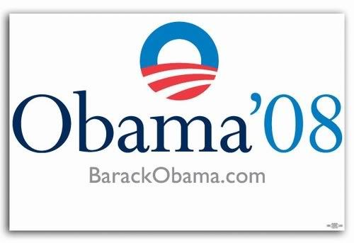
In issue # 006, Sept/Oct 2007, page 116, Ryan Bowman looks at the different presidential candidates' logos and analyzes them. Here is what he said about the three current contenders (I'm leaving out the others for now):


Barack Obama

Beautiful but empty. Tries hard to avoid the traditional vocabulary of political design btu ends up using the same familiar tropes - patriotic colors, red and white stripes, heavy handed Steinbeckian symbolism, and even a font named Perpetua.


Hillary Clinton

A ruthlessly efficient (and no doubt relentless focus-grouped) combination of the campaign logos of the past two presidents: The waving, stylized flag from that other Clinton and the one name simplicity from Bush, George W.


John McCain

So blatantly militaristic, the tagline might as well be "An Army of One."


I think it's really interesting how the logos describe the candidates, or at least the perception of the candidates. I really wonder sometimes how much people rely on visual cues like these in choosing not only who to vote for but what toothpaste to buy. I know that I prefer a specific acne medication because of its packaging - I am aware of the fact that before they changed the colors from dark blue and red and terribly chunky lettering to white with icy blue and light black lettering, I pretty much thought all of their products gave me acne. I, like many others (I assume), want to use medication for their pimples that comes out of a clean, crisp container, not brightly colored and obvious (um... like a pimple). At least I am aware of it, I guess.

Monday, March 24, 2008

JewishGuy & JewishGal are Engaged!


(I know this isn't an art post but I feel like it's important enough to mention, also the ring is really pretty - it's his bubbie's ring that we resized - and I like to show it off)

Sunday, March 23, 2008

Hamentaschen


These are the hamentaschen JewishGuy and I made this year :)

JewishGuy was the master of the baking. He created the delicious dough that has orange and lemon zest. It's very moist, soft and delicious.

I was in charge of the construction. I put the jam in, sealed up the corners and tried to make the seams disappear. I have to say they look (and taste!) bakery-quality. Fantastic!!
. . .
Related Posts Plugin for WordPress, Blogger...